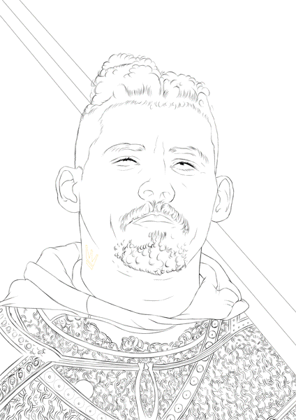
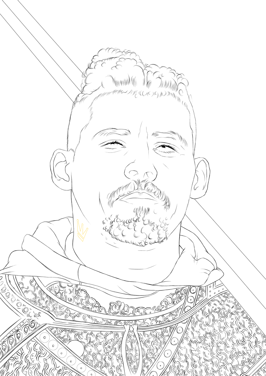
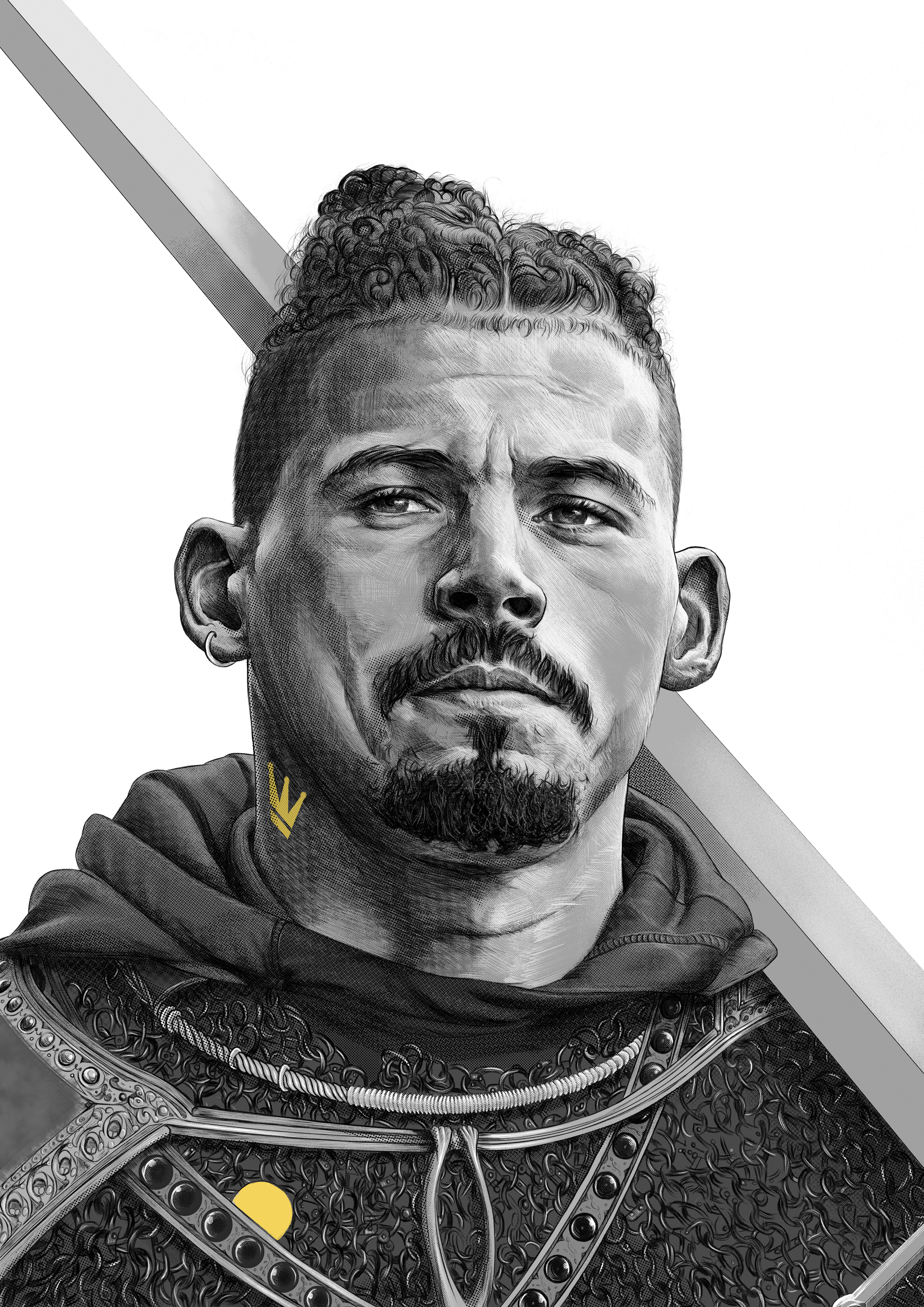
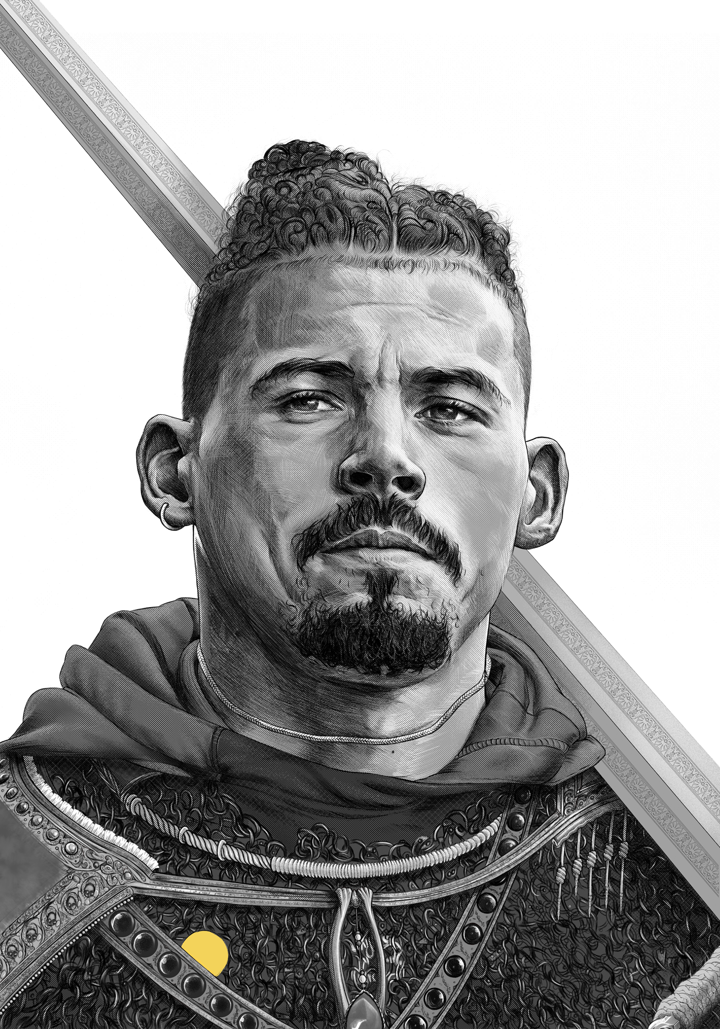
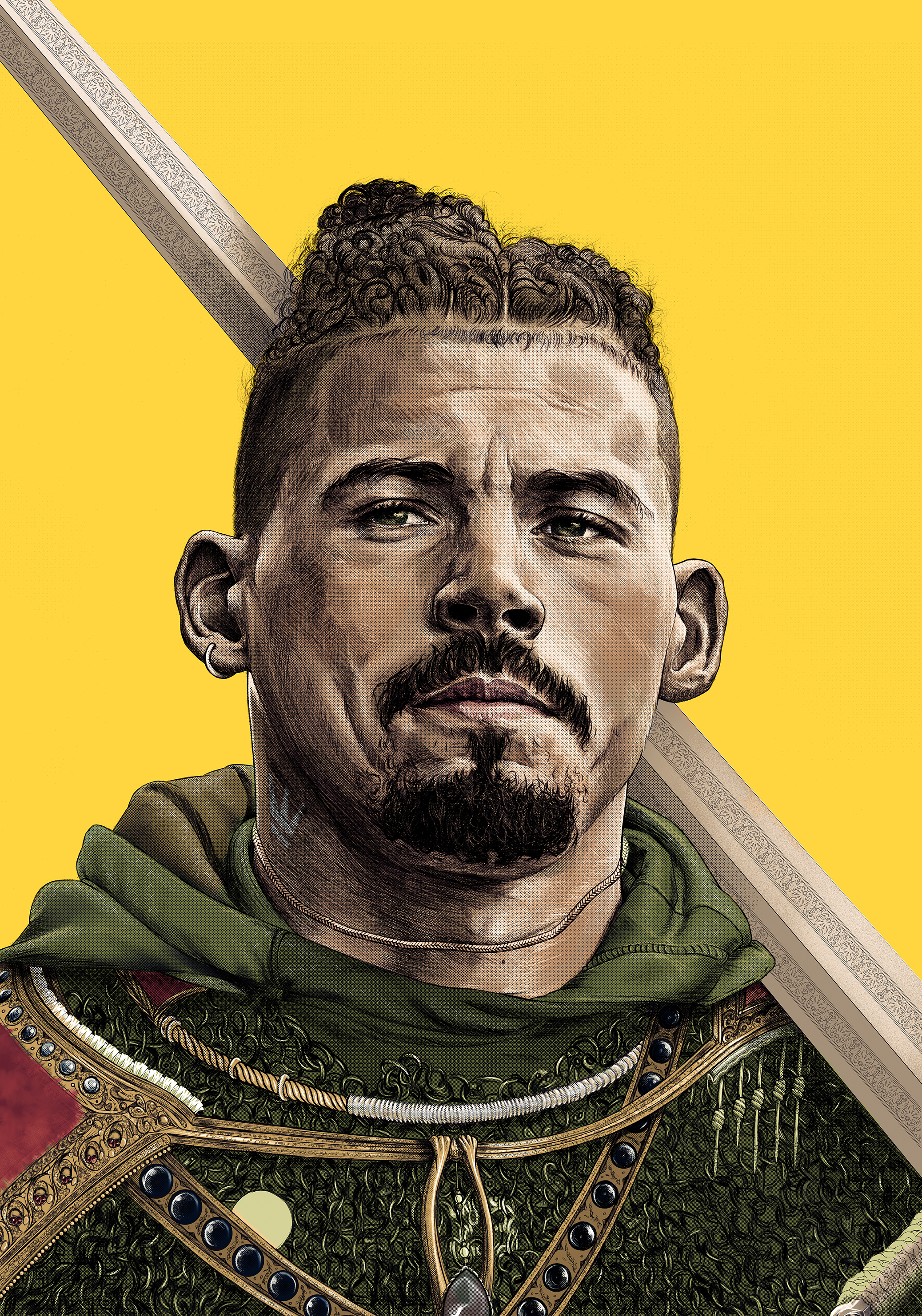
Kalvin Phillips Cover Process
I’m not hugely successful, or particularly talented. There’s no real reason you should listen to me about anything involving art, or anything else really. But I do get a lot of questions from people asking for tips. Where to start, how did I do this etc.
This page, and my teaching abilities, are a work in progress.
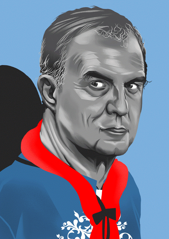
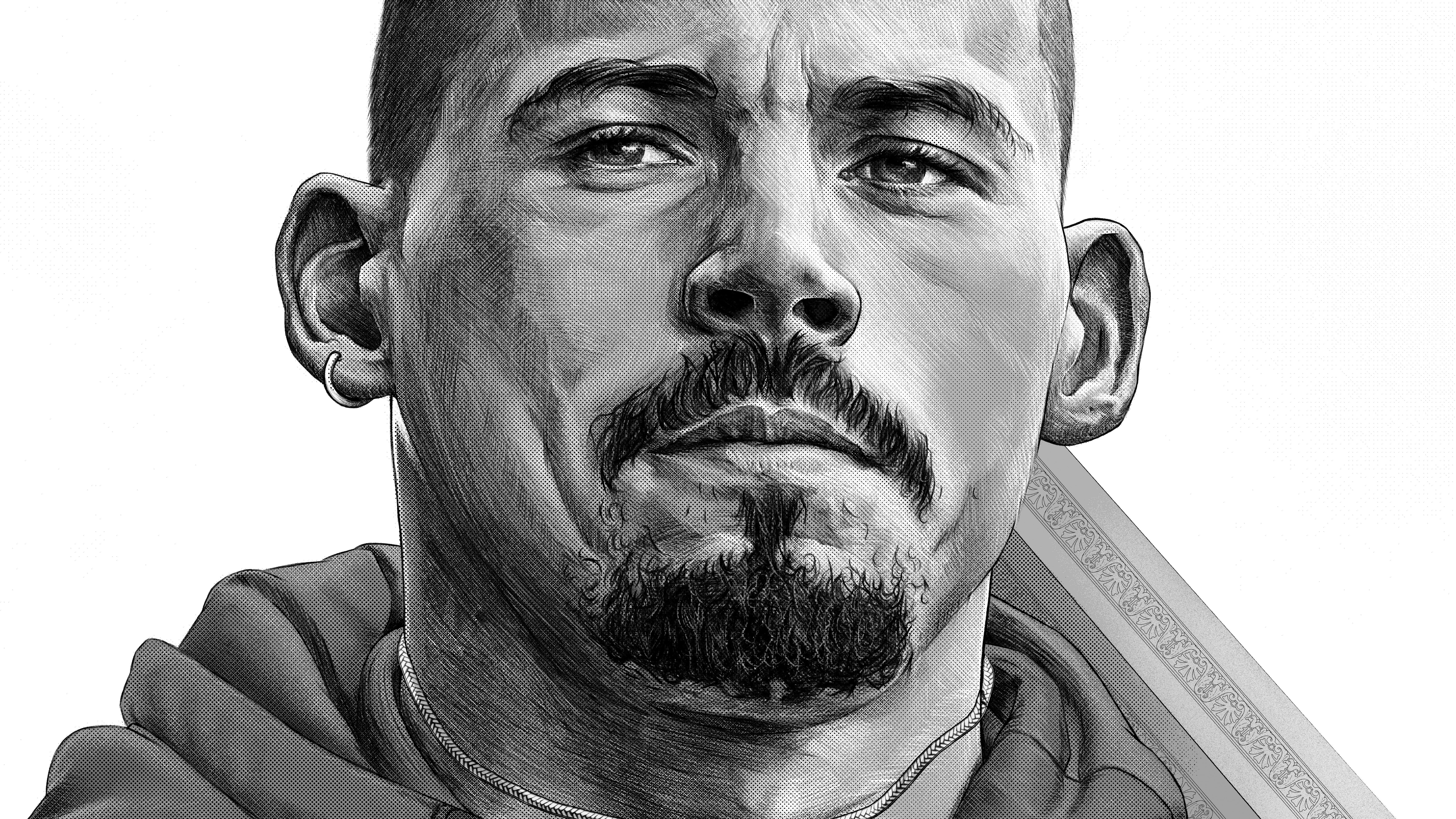
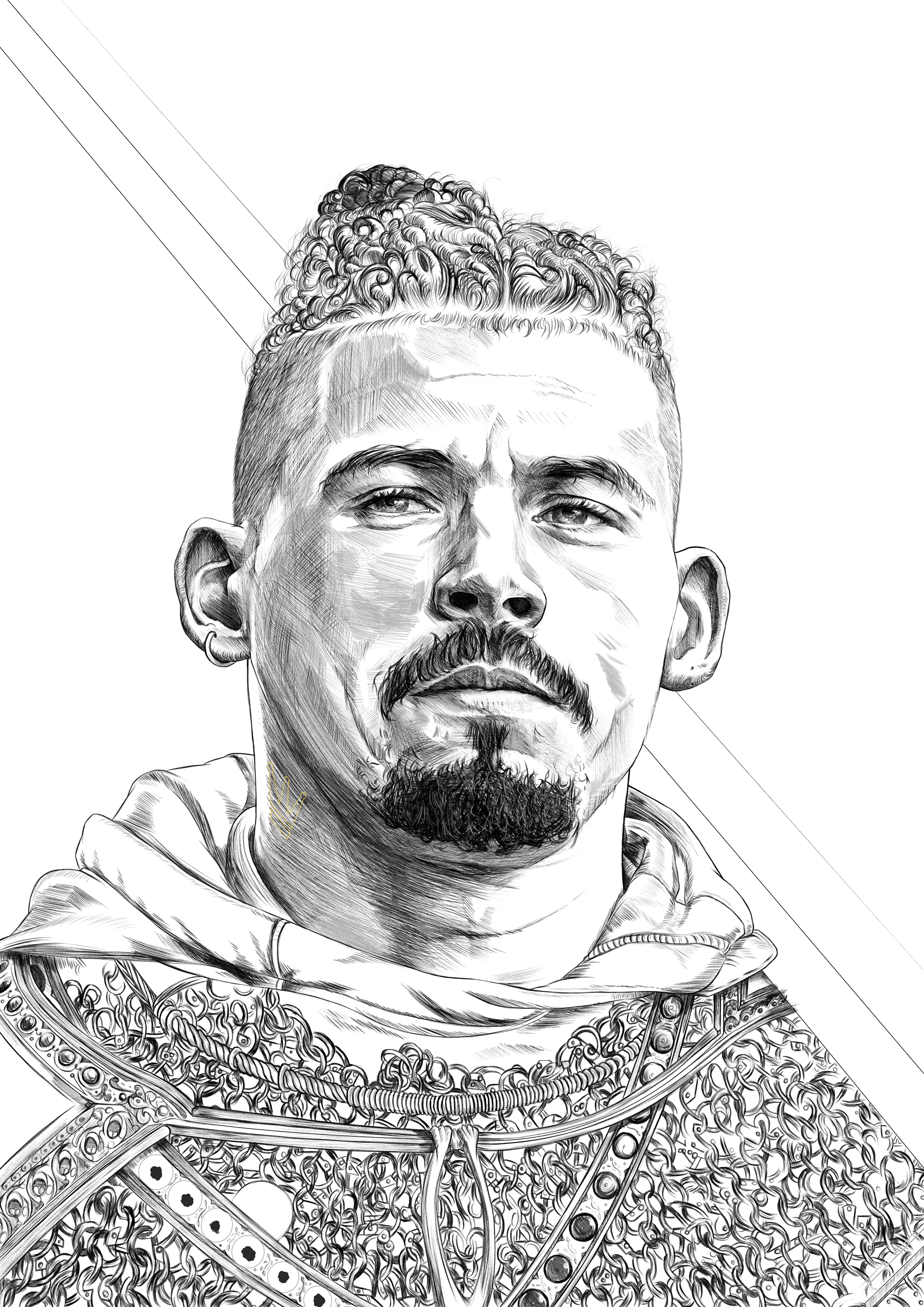
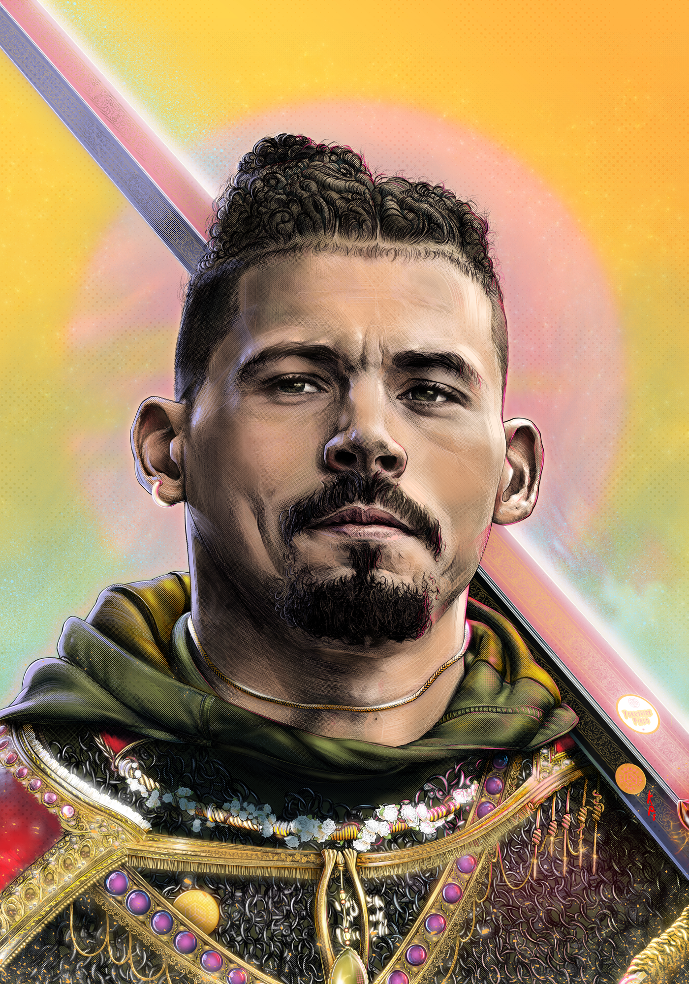
The piece I get asked most about is this Kalvin Phillips cover I made for The Square Ball. So here’s a quick run through of what I used to make it, and how I went about it.
You’re probably only reading this because I sent you here after you asked me for advice. Anybody else can freely ignore everything I have to say. It’s simple stuff.
This is aimed at people starting out.
A lot of basics.
(Don’t try to read this page on mobile.)

1: The Tools
Everything I make starts on an iPad using an Apple Pencil. I started out with a Wacom Intuos 4 and Photoshop but never really got used to the seperation of drawing on a tablet then only following the result on a monitor. Whilst the iPad is a large investment absolutely nothing beats the 1:1 nature of using the Apple Pencil on a screen with no noticable parallax. It’s so close to what I was doing when I was 14 years old in a sketchbook. If I could afford a Wacom Cintiq, I’d be using that though. Keep that in mind.
I’d highly reccomend a screen protector for the iPad, aside from how terrifying it is that you might damage the screen, screen protectors add a tooth much like drawing on paper.
Makes a huge difference.
This is the one I use: ClearView PaperLike
They do make you want to die when installing them, and provide a slight haze to the iPad screen but it genuinely is worth it.
We all want to die eventually anyway, might as well get a feel for it.
THE DIFFERENCE BETWEEN 11” AND 12.9” IS EXTREMELY NOTICEABLE
THE DIFFERENCE BETWEEN 11” AND 12.9” IS EXTREMELY NOTICEABLE
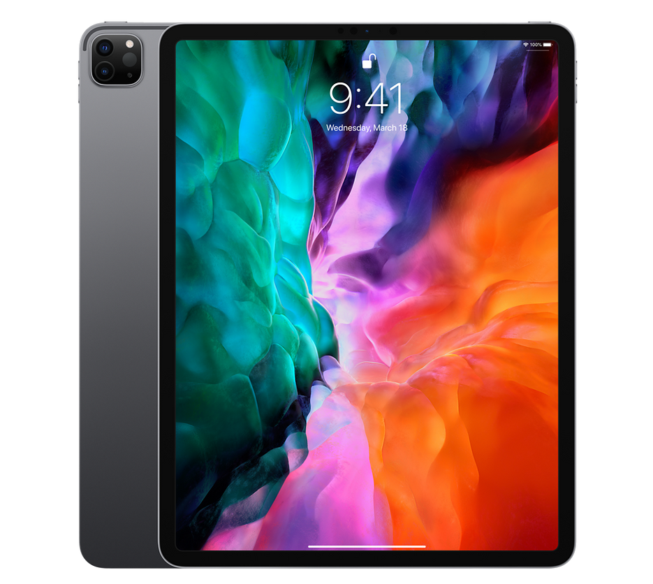
iPad Pro
2: The Apps
Clip Studio Paint
Procreate
Adobe Photoshop
Clip Studio Paint has a very natural drawing engine, the build up of pencil strokes etc. I do a lot of my base linework in this app.
Procreate is my favourite app to paint in on the iPad, nothing else comes close to getting the most out of the Apple Pencil. The stock brushes are also extremely good, and there’s plenty of brush packs to sweeten the deal.
Adobe Photoshop remains the king for colour correction, and of course has all of Kyle T Webster’s brushes as standard. If I had a full Wacom Cintiq I’d probably paint in Photoshop over Procreate just to avoid swapping files between devices, but I don’t, and Procreate fills in nicely here.


3: The Brushes
For some reason people are very keen to pretend brushes don’t matter, and actively resent being asked. Presume it’s because they’re keen to make you believe they rendered each individual strand of hair or something. I actually did render each individual strand of hair for Kalvin though. Anyway brushes do matter. They don’t automatically make you a great artist, and lots of the best artists use a standard round brush for everything. However gatekeeping a certain aesthetic is for weird bitter little people. Gatekeeping in general is for weird bitter little people. We don’t oil paint with a fork, we choose a very specific brush with a very specific feel don’t we. No different in the digital world.
Procreate’s default brushes did most of the work here. I also used various brushes that come packed with Photoshop, from Kyle T Webster, here and there.
Kyle T Webster
The Actual Process
Setup:
Tablet: iPad Pro 12.9”, Wacom Intuos 4
Program: Clip Studio Paint, Procreate, Adobe Photoshop
Resolution: 7000 x 10000 pixels
DPI: 600
Colour Profile: sRGB in Clip Studio & Procreate, Adobe RGB (1998) in Photoshop
Adobe RGB (1998) isn’t necessarily a good idea, it’s just what I used.
This colour profile plays very badly with iOS.
CMYK is always going to be the final print colour profile.
7000 x 10000 pixels is the document size recommended by the maker of the pencil brush I used to ensure full fidelity. I later cropped it to 7016 x 9921, as in A3 at 600 DPI.
The fanzine is only A5 but I hate myself.
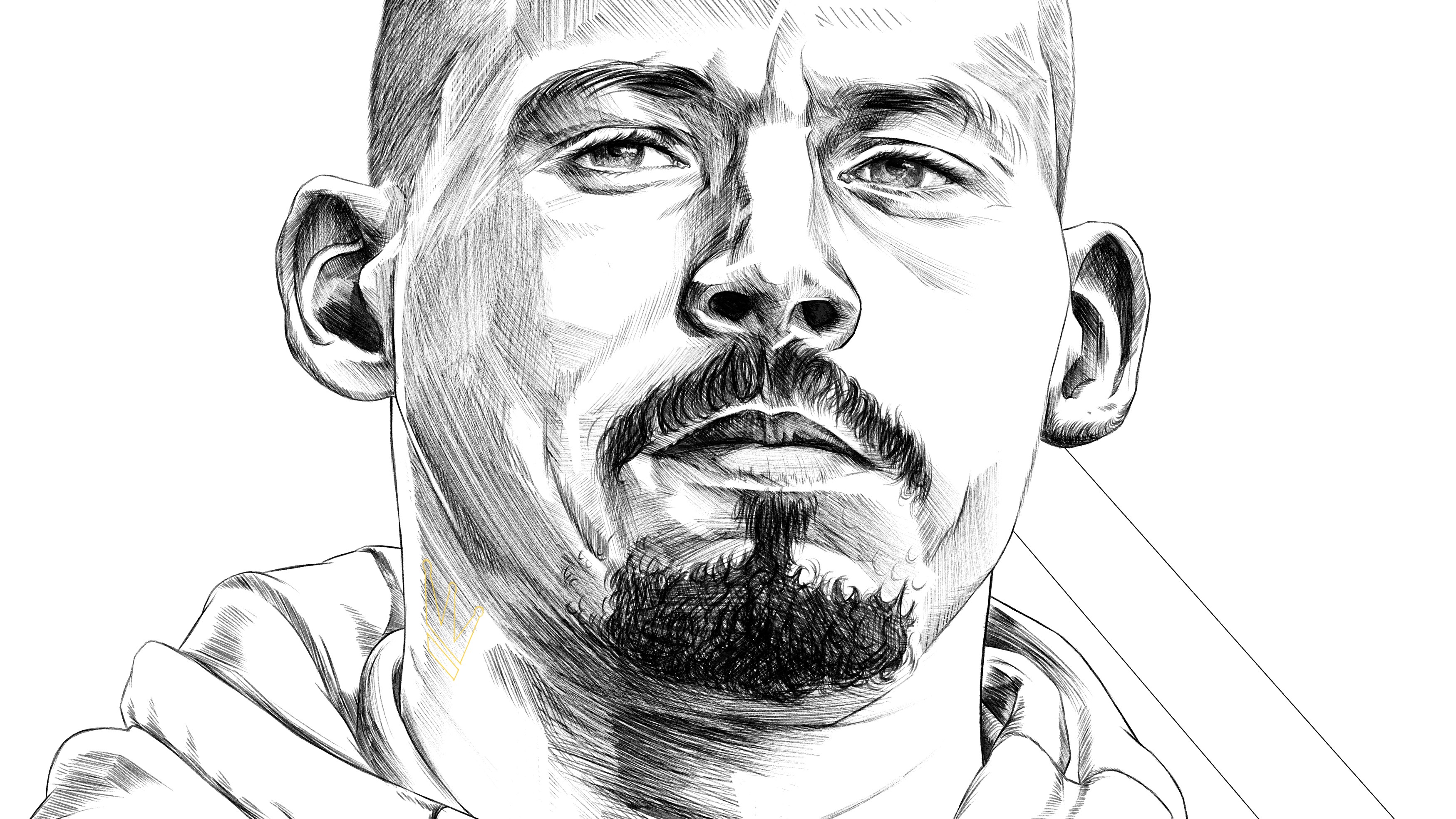
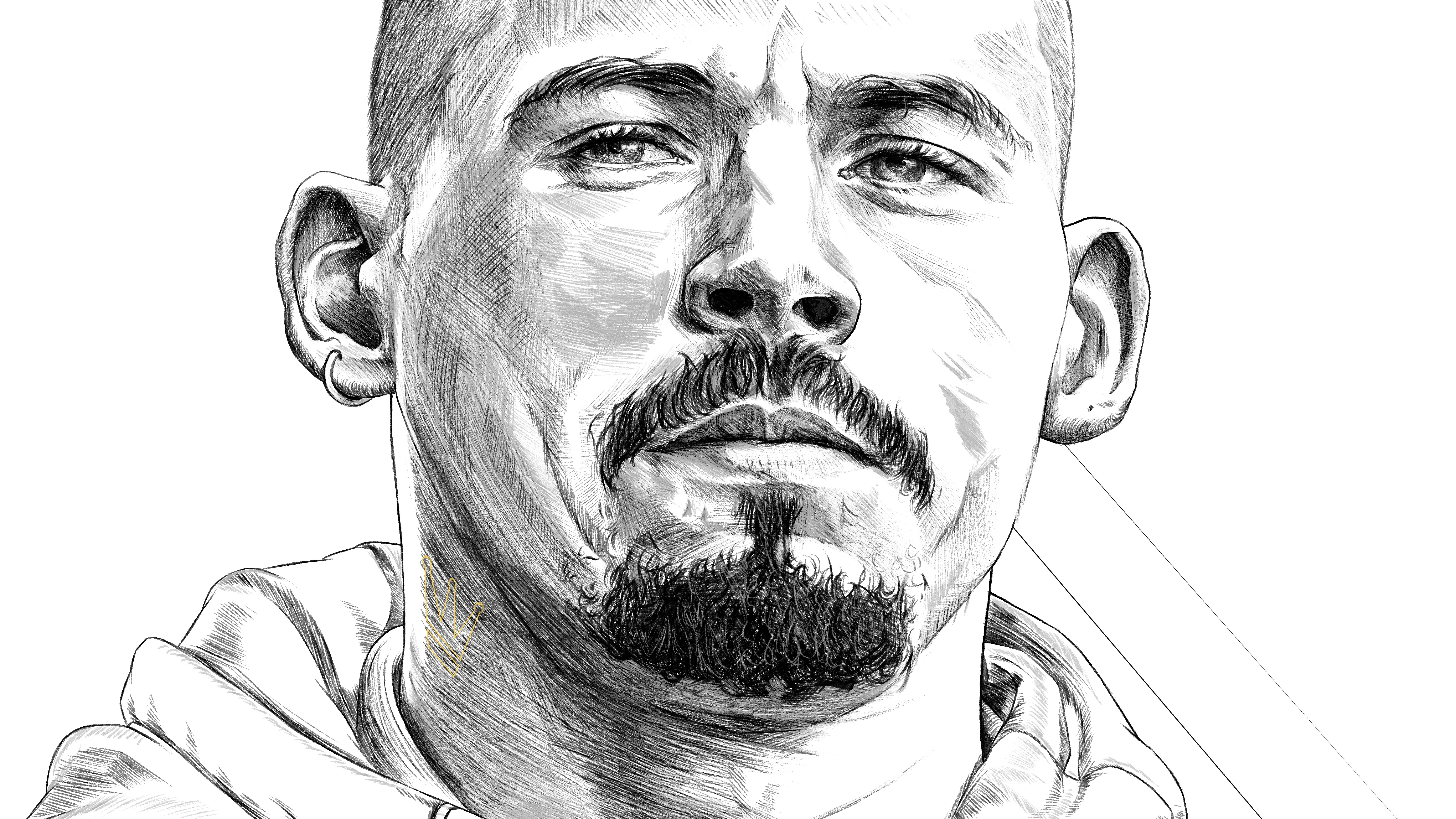
Steps 1-6: Black and White - Clip Studio Paint
When doing any sort of portraiture I start in grayscale. Keeping all your focus on values and being able to ignore getting the skin tones right as you’re building the image helps me massively. Everything at this point can be visualised in grayscale terms, leaving you solely able to focus on drawing.
Clip Studio has a huge library of brushes you can pick from, all sorts. Patterns, pencils, the lot. Plus it doesn’t have a layer limit on iPad like Procreate. So starting a drawing with such a high resolution has to start in Clip Studio unless you like having 3 layers max. It is a little obtuse, but it does kind of work like Photoshop.
![]()
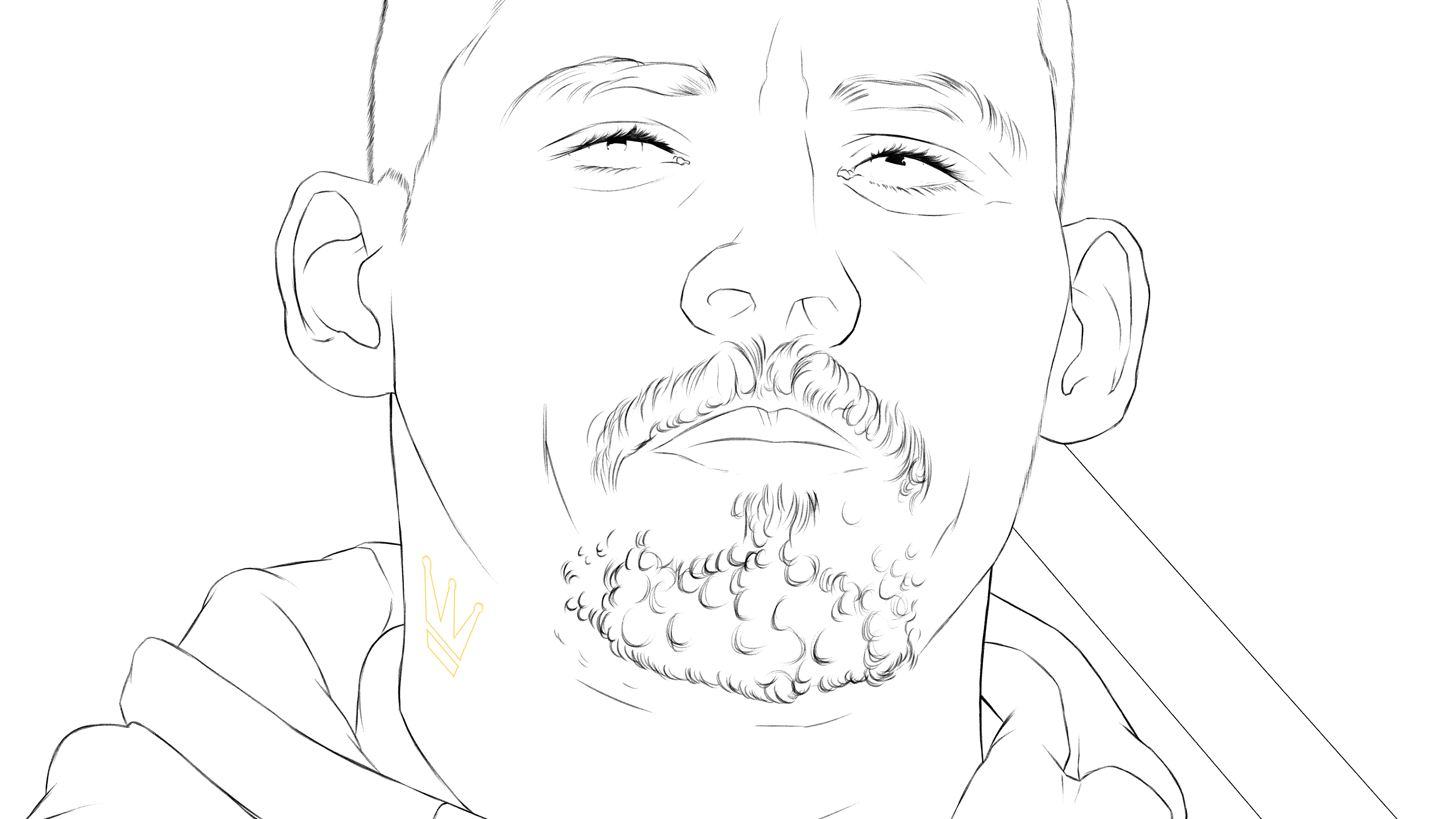
Base line drawing.
Base sketch work.
Tone.

Flats.
Combined tone & flats.
Patterns, final details.
There’s not a huge amount to say between these steps. Hopefully the imagery is mostly self explanatory. I’m not here to teach you how to draw, just the particular process I used to make this drawing.
But here’s a quick tip:
I’ve no formal education in illustration. So it was left mostly to me learn the basics. Whilst these weren’t essential to teaching me what I know it’s nice to have some fundamentals explained to you. Books by Andrew Loomis have been incredibly helpful.
Andrew Loomis: Drawing the Head & Hands
Andrew Loomis: Successful Drawing
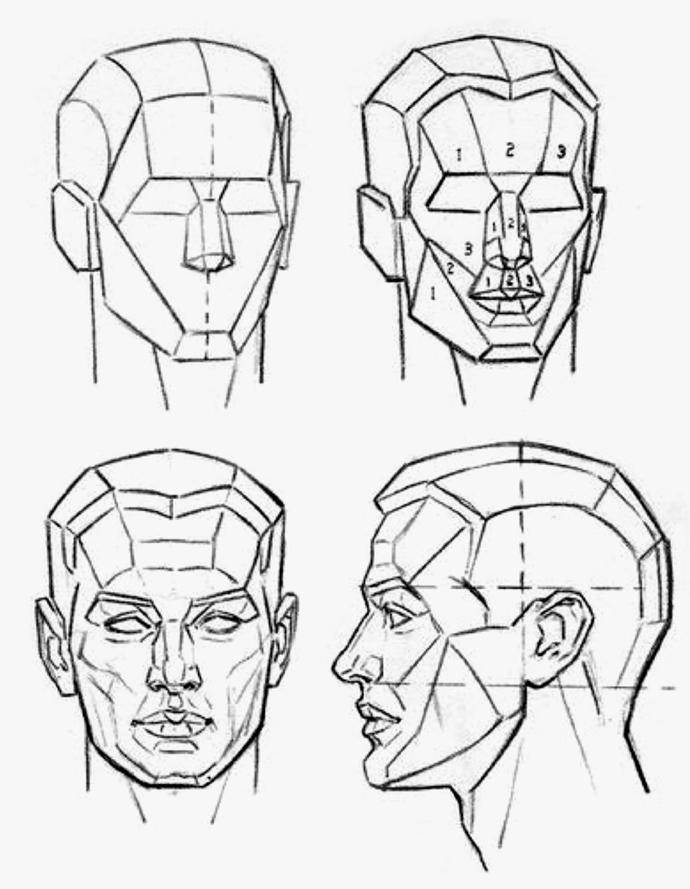
As is the nature of education it eventually all comes together to define your style. Just for style reasons alone I like leaving hints of Loomis’ construction lines for faces.
Still wish I studied at an atelier though, pre COVID of course.
Still might, post COVID of course. Florence has a nice one.
But I’m a Loomis man, it’s what I am.
Join me.

1

2
3

4
5
6
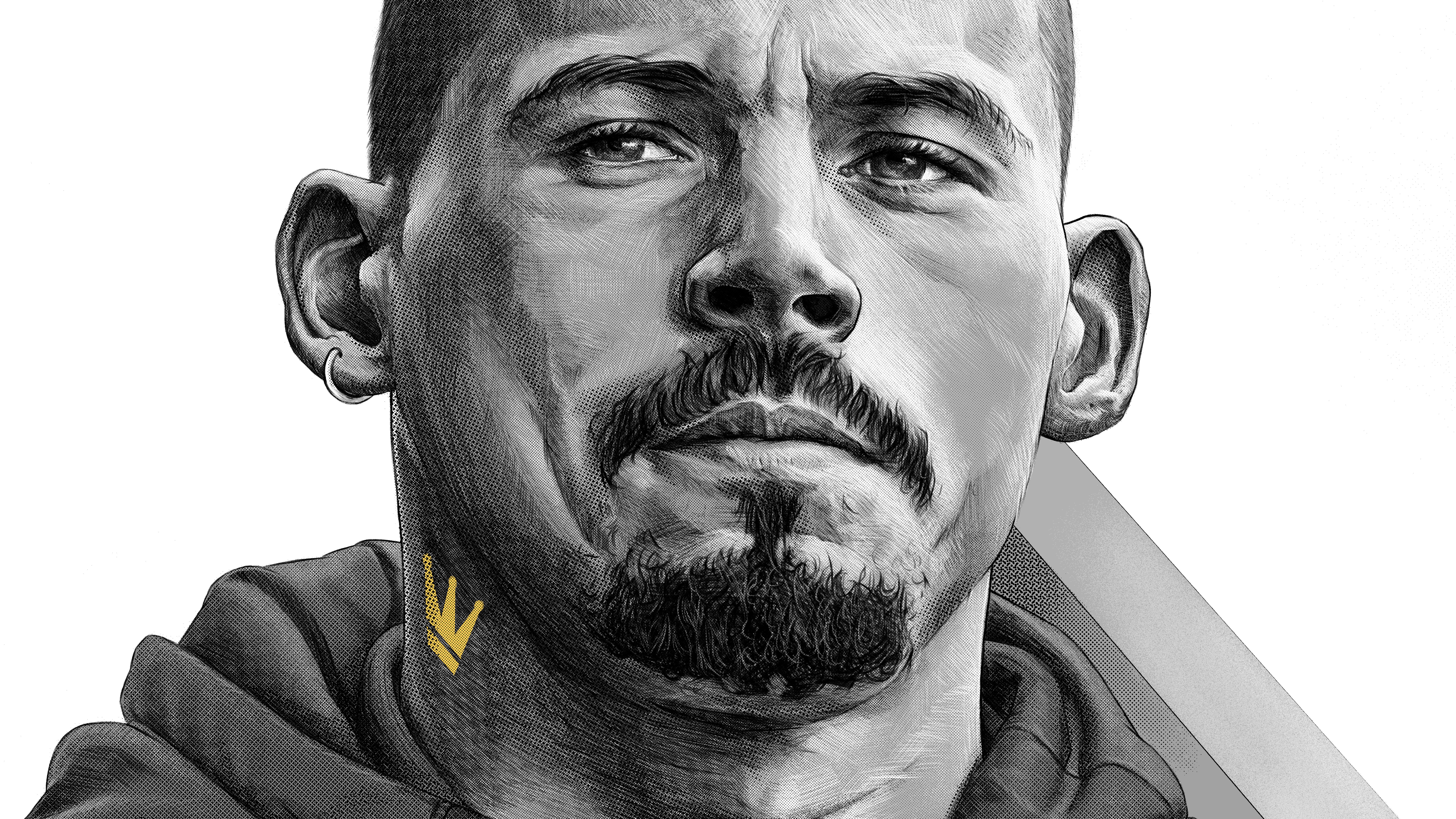
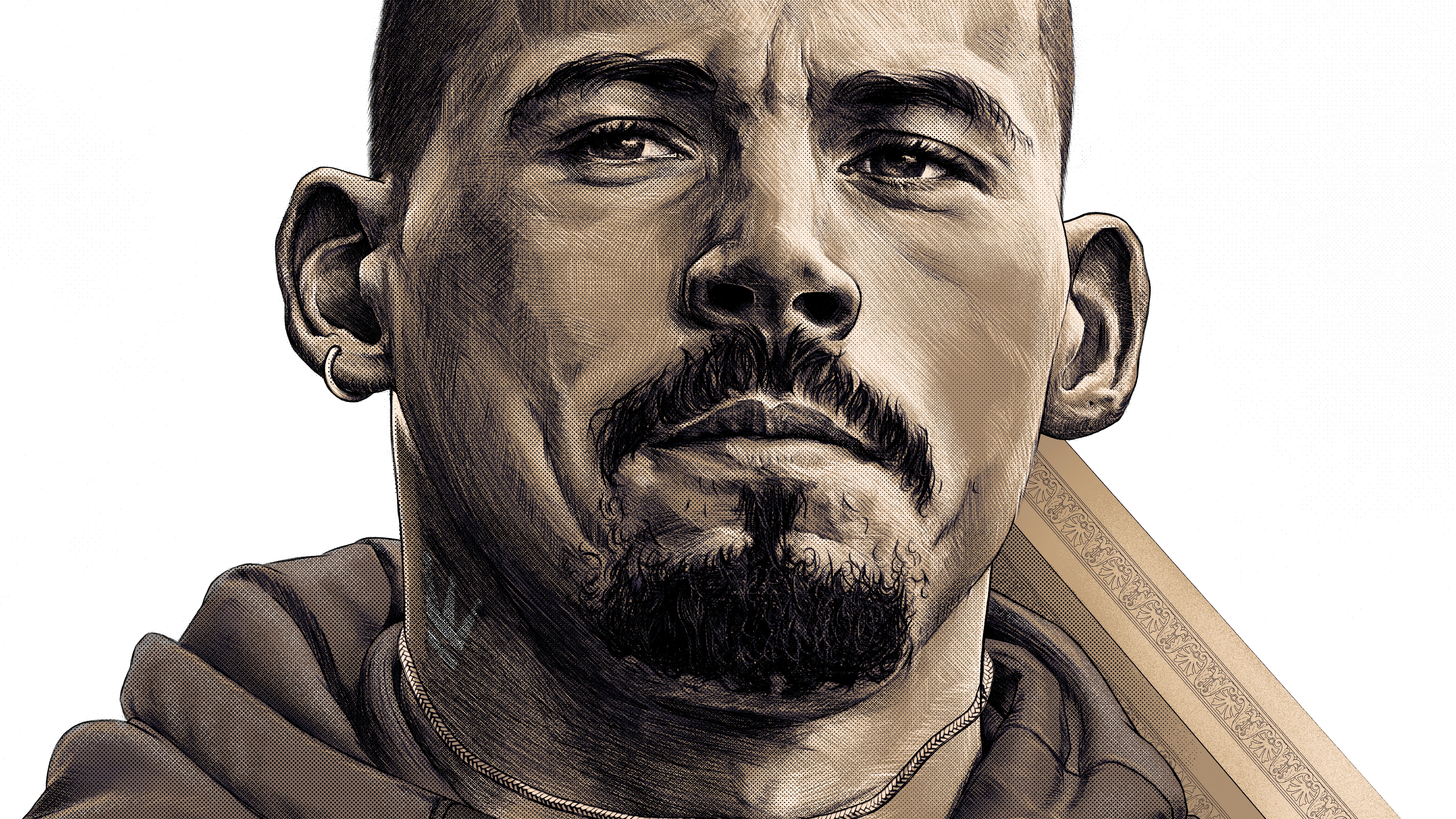
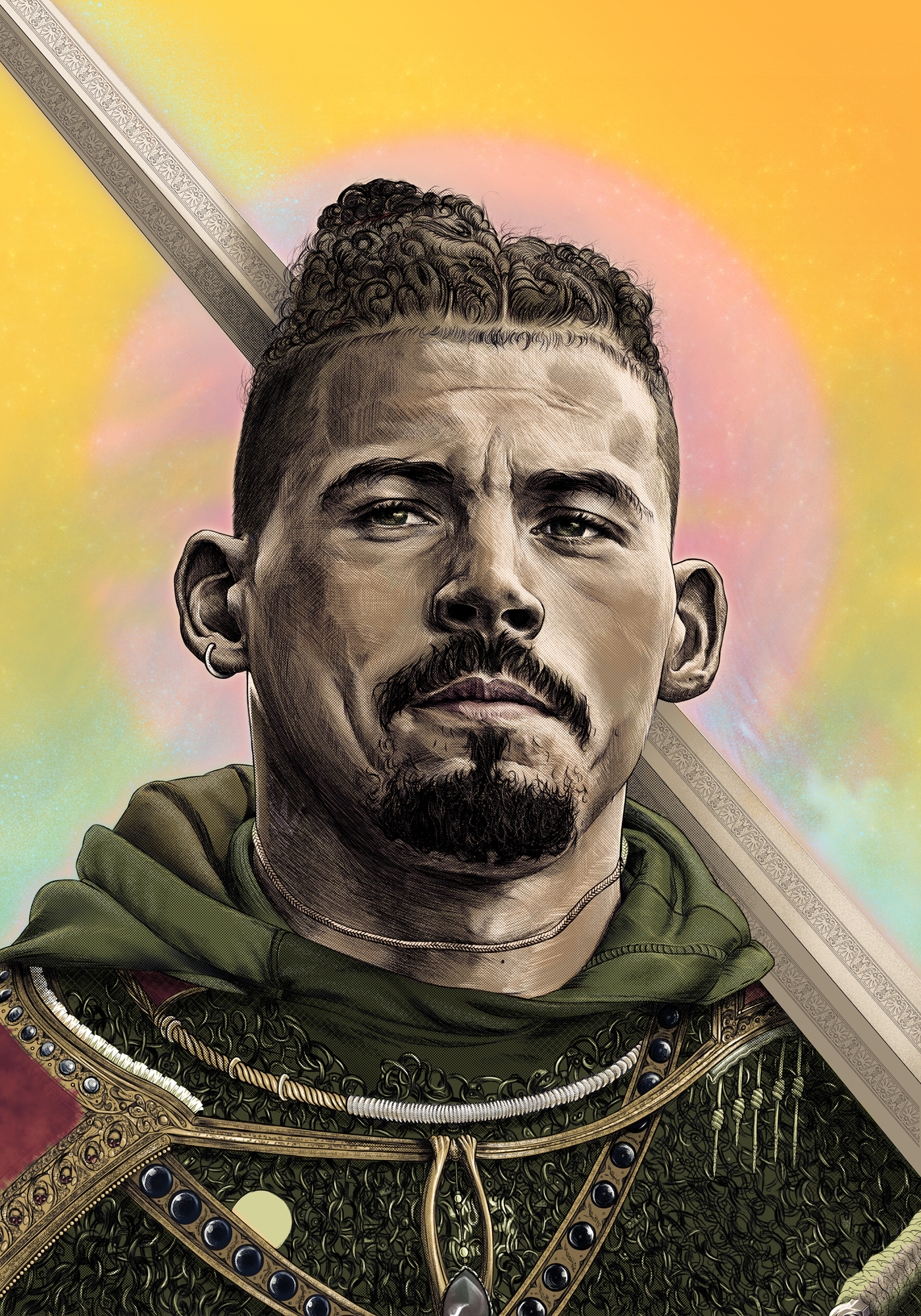
Step 6.5: Gradient Maps - Photoshop
This is a .5 step because it’s not essential to the process.
Whilst it’s not essential, it’s still a useful thing to do with a grayscale drawing. Gradient Maps can inject saturated values into the grayscale drawing, whilst retaining the tonal depth. This is the Gradient Map I used for Kalvin, but it’s very much a personal thing. Just choose whatever you like best. What a gradient map is doing is assigning colours to the tones in your work. Each end of the scale is where it’s assigning the colour to. Shadows, midtones, highlights etc.

Step 7: Rough Colour & Painting - Procreate
Roughed out the drawing, now start adding the basic colours using the Colour Layer Modes, just paint straight on top of the grayscale drawing, in new layers of course. The colours will be rough and muddy, but all you’re doing is setting the base. These first stages are so rough you can do them in Photoshop if you prefer, nothing necessary about Procreate for the rough Colour Layer Mode. Notice it looks terrible at this stage, never be discouraged by things looking terrible.

7
Step 8: BG & Base Effects - Photoshop
This is a good stage to add some background elements. It’s just early enough for what you add to be considered part of the base drawing going forward, which makes all the later effects and colour correction much easier to judge. Added the moon, sword glow & sparkles, and an Outer Glow layer effect to the Kalvin folder. A light blue gradient from the bottom of the page to add some depth to the image.
![]()
8
Step 9: Painting - Procreate
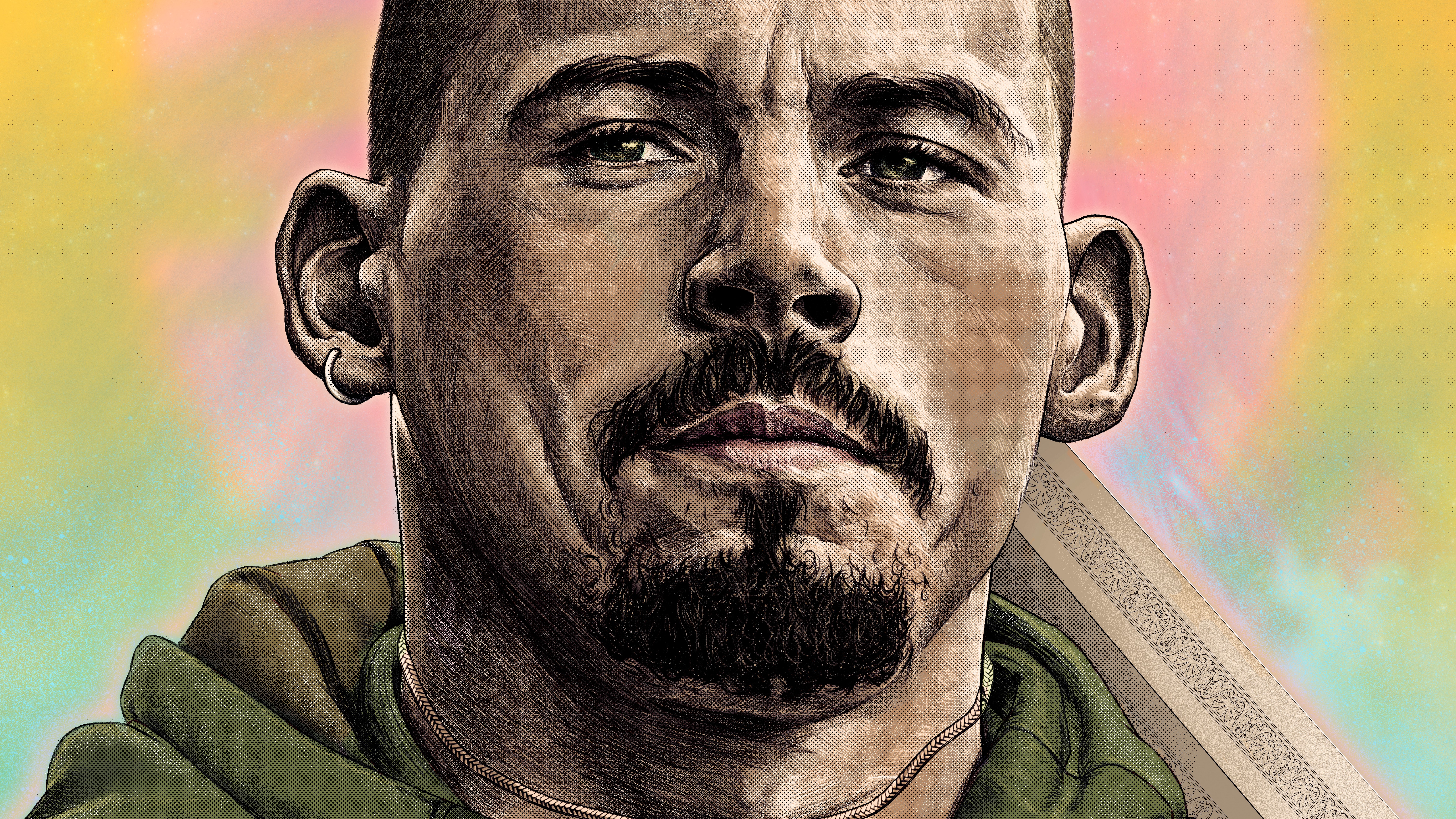
And now, you just paint. You just keep painting, use the tones you’ve roughed out to now fully render the portrait. Paint until it looks good. Add all the elements you want, the effects, the flourish. Make things glow. The base has been set and now it’s all about just spending your evenings destroying your spinal integrity by detailing a cloak for an A5 fanzine.
![]()
![]()
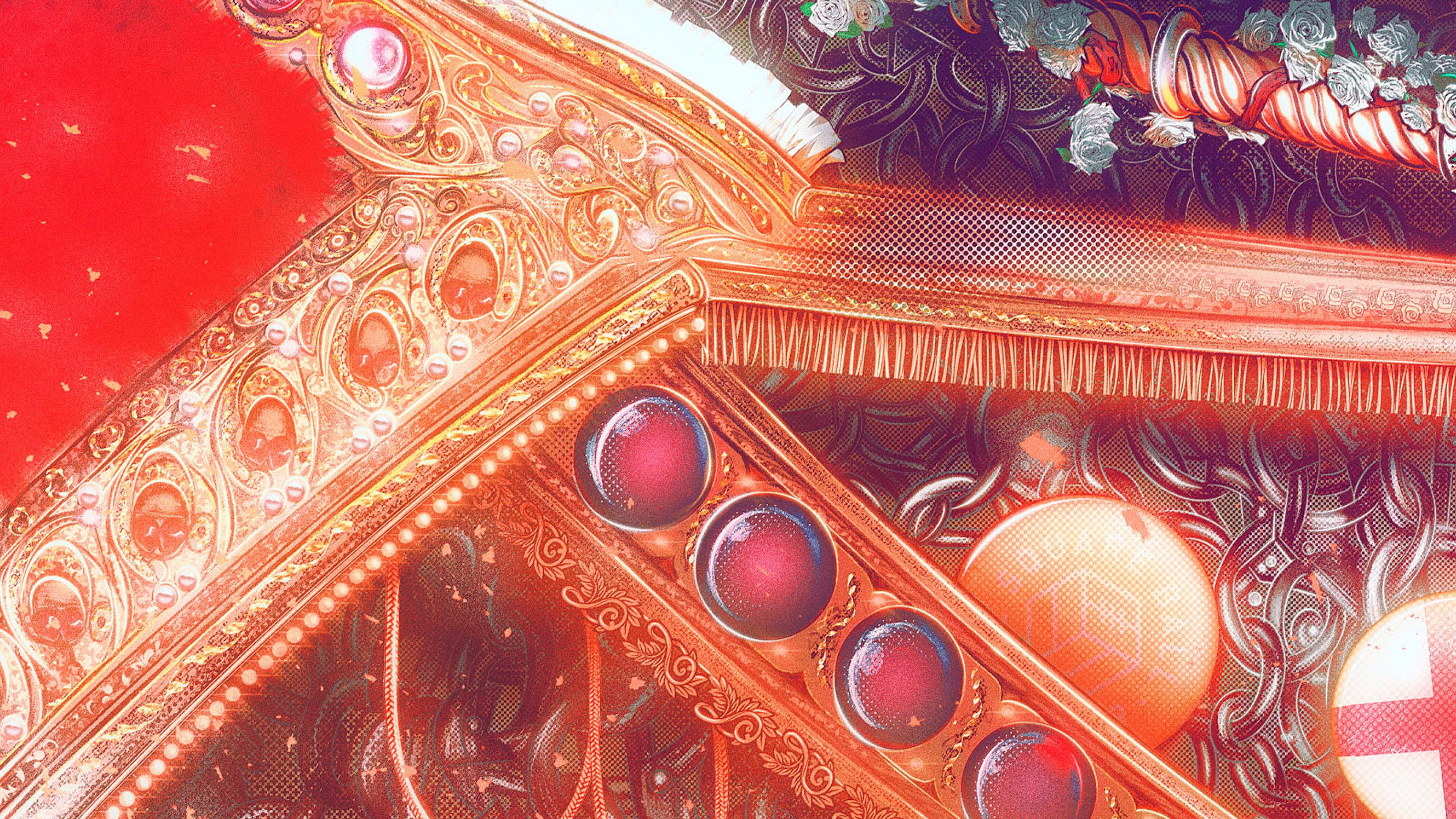
A5 fanzine. A5.
I don’t get nearly as much abuse as I should for stuff like this. But hey, I could sell these prints at A0 if I wanted, that’s what really matters. Don’t be me. Unless you want to be me. Then go for it. If you’re reading this you might want to be me. Being me means you’re physically compelled to draw at 300% zoom. You shouldn’t, thats the reason for this little paragraph. Better artists achieve the same result with far less time spent on stuff you can’t make out. You really don’t need to do this. As I get better I’ll learn proper mark making economy. Until then?
This is what I am.
I might actually sell A0 prints, might look nice in a big golden frame. But I’m using this part of the tutorial to tell you to explicitly avoid doing what I did. There’s no need for it. That’s the lesson here. I actually think it would look better if I used less detail. Please don’t be me.
9

9.5
Step 9.5: Things I Do - Procreate/Photoshop
Anyway, these dots, set to Soft Light at 27% opacity. They add to the general halftone aesthetic I used across the piece. Things like this just slowly build up as you make something like this, endless amounts of little subtle effects.
Dust, particles, various things to add to the ambience.
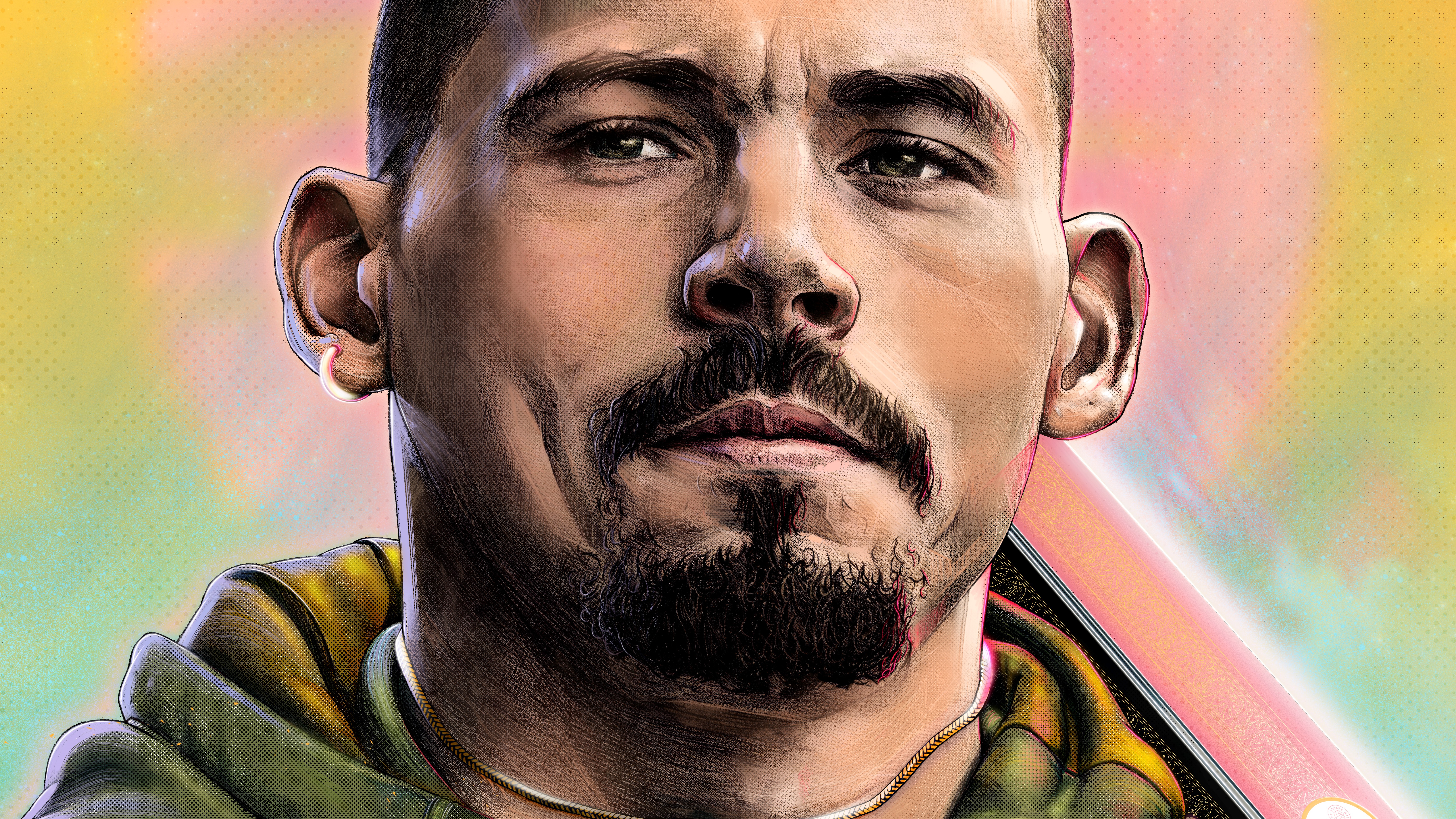
As you might be able to see in the ‘Photoshop Preview’ thing, the actual image I saw when designing in Photoshop was much more corrupted looking. It’s very much the nature of pixels, rendering, transparency and various other factors like resolution that the final image changes a lot on output. But I did try to go for a more video gamey style to the shading. I’m pretty happy with the smoother result, but I thought something more contrasty would work for the A5 nature of the fanzine. Too bad I’m not smart enough to know how to compensate for this shift.
The way I went about that corruption look is using Colour Fill layers, and kinda breaking them. Choose a colour, like a certain blue, and set it to Darker Colour or Lighter Colour layer mode. Play with the opacity and the ‘Blend If: Gray’ layer blending options so it’s more of a subtle addition to the shadows and highlights. But it’s just a blunt way of colouring shadows/highlights that produces a kind of corrupted dithering effect I like. Full opacity but high value hues can add a nice subtle stroke to the tones using this method.
You can see how many of these kind of layers I have in the colour correction step below, they’re the ‘Colour Fill’ layers. That’s a top little secret of mine, my style laid bare.
![]()
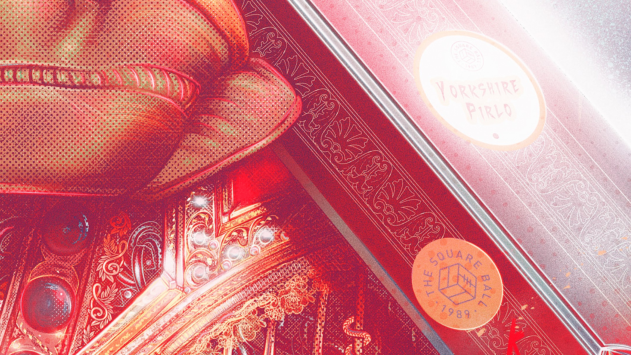
I also like adding stickers to these kind of portaits. Badges, stickers, TSB merch style things.


Step 10: Colour Correction & Texture Application - Photoshop
Non destructive colour adjustment via Selective Colour Layer Adjustments, Gradient Fill Layers, Brightness & Contrast etc. None of this can be done in Procreate to the level of Photoshop. Photoshop may make all of us want to die, but it’s the gold standard for colour correction. Never get too lost in the look before this point, you can dramatically change everything you’ve done. That yellow BG in steps 2/3 is still yellow in the file, I just used Selective Colour to make it red, and blue. Another little shortcut I like to use is the Colour Lookup as an Adjustment Layer, just pick whatever option you like best, it essentially just groups your colours into some complementary presets. Very helpful as a base to continue your colour correction adventure.

frnak
TOP. maybe. top. top. maybe. top. maybe? frnak. This is the colour correction folder for the file. Three seperate screenshots are needed to see them all. Layer names that make sense are reserved for when someone else ever has to use the PSD. But you get the idea, there’s a lot in there. Grain, gradients, colour fills. A whole lotta stuff. I’m not sure I can really explain how I do it, and how you should do it. It’s very much a kind of keep tweaking until you like the result kinda deal. All there is to definitively say is that your final drawing doesn’t have to look that way if you don’t like it. You can change practically everything in post.
No weird layer names.
Lots of weird layer names.
One very consistent thing I do is adding grain to an image. A nice filmic look is always my aim, but might not be yours. It’s not quite as simple as googling ‘grain’ then jamming it in there.
Basically.
Layer fill. - Some grey tone. Warm. I used #514c4a
Filter - Noise - Add Noise. 10-20%
Hue/Saturation. - Remove the warmth from the grey depending on the desired result.
Set the layer to Overlay at 20% - 30%. Tweak until you get your desired result. Can also try Soft Light, or whatever you like my guy.
Doing it this way rather than using a grain texture off google is that this is infinitely scalable, resizing won’t fuck around with the fidelity.
10
exempli gratia
Grain

11
Anyway, if you wanted an only slightly detailed tutorial on how I made this Kalvin thing, you got it. If you wanted more, ah well.